Ghoosterk: A Spooky Display Font That Delivers Digital Impact
It started with a landing page refresh for a small creative studio launching a seasonal Halloween campaign. I opened Figma, dropped in their hero section mockup, and tried three different display fonts—none quite landed the tone they wanted: bold enough to grab attention, playful but not childish, spooky but not cartoonish. Then I loaded Ghoosterk.
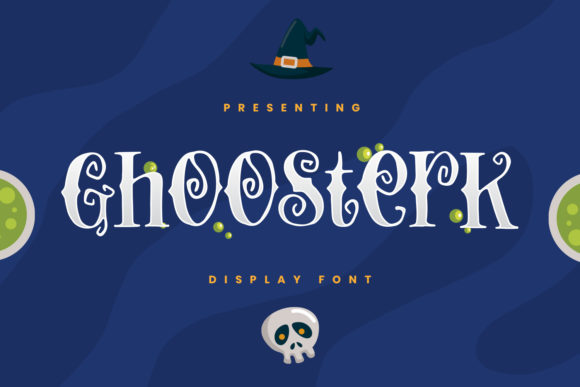
Right away, its thick-lettered, slightly uneven strokes gave the headline instant presence—like hand-painted signage at a haunted house, but refined for digital screens. The letters have subtle irregularities: slight tapering on terminals, uneven stroke contrast, and a confident, grounded rhythm. It’s not a script or serif—it’s a display font built for moments where personality matters most.
I tested it over a moody gradient background (deep plum fading to charcoal) and it held up beautifully—even at 48px on desktop and 36px on mobile. No pixelation, no awkward spacing collapse. Because Ghoosterk is designed as a display typeface, it shines where you need emphasis: hero headlines, section dividers, limited-edition product banners, and campaign announcements. It’s not meant for paragraphs or navigation menus—and that’s exactly why it works so well.
In that same landing page, I used Ghoosterk only for the main headline (“Trick or Transform”) and the CTA button text (“Claim Your Spell Kit”). Everything else—the subhead, body copy, and footer links—stayed in a clean, highly legible sans serif (Inter, set at 16px/1.5 line height). This pairing created instant visual hierarchy: your eye lands on the Ghoosterk phrase first, then flows naturally into supporting text. That’s typography doing its job—not just looking cool, but guiding attention.
For readability on mobile, I kept Ghoosterk usage tight: never more than six words per line, always with generous letter-spacing (0.04em in CSS), and always against high-contrast backgrounds. On dark mode previews, it stayed sharp. Over image overlays? I added a subtle semi-transparent dark scrim behind the text block—no guessing whether the letters would pop. Ghoosterk doesn’t fade into busy visuals; it commands space, but only when given room to breathe.
I also checked what came with the font file. Ghoosterk includes one weight (Bold), no italics or alternates—but that’s intentional. As a display font, its strength lies in singular impact, not stylistic flexibility. It supports Latin-based languages (English, Spanish, French, German, etc.), which covered the studio’s audience. And yes—I confirmed the commercial license covers web use, embedded assets in Figma prototypes, and live deployment via self-hosted WOFF2 files. No surprises at launch.
You’ll find Ghoosterk working hardest on sites where mood drives engagement: a boutique online store highlighting limited-run Halloween merch, a coaching site launching a “Shadow Work October” challenge, a portfolio site teasing a new series of eerie digital illustrations, or a course sales page for a branding workshop themed around “Dark Mode Identity.” In each case, it’s not the font doing all the work—it’s how it anchors the brand voice visually.
That said, Ghoosterk isn’t for every headline. I wouldn’t use it for form labels, pricing tables, or legal footers. Its personality is too strong for functional UI elements. But for short, emotionally charged phrases—“Enter If You Dare,” “Pumpkin Spice & Pixel Magic,” “This Page Is Cursed (in a good way)”—it adds texture, warmth, and unmistakable character.
Pairing is key. I’ve seen Ghoosterk paired successfully with:
- A neutral sans serif (like Inter, Poppins, or Manrope) for body text, buttons, and captions—clean contrast without competing energy.
- A warm serif (such as Cormorant Garamond or Literata) for blog headers or editorial-style campaign pages—adds sophistication while keeping the spooky vibe grounded.
- No secondary font at all—just Ghoosterk + system sans for interface elements. Sometimes minimalism amplifies impact.
What surprised me most was how consistently it improved perceived brand effort. Clients noticed the difference before they could name why—the headline didn’t just say something, it *felt* like an invitation. That’s the quiet power of thoughtful display typography: it signals intention, care, and alignment between message and medium.
If you’re evaluating Ghoosterk for your next project, ask yourself: Where does your audience pause? What moment deserves extra weight? Is this a place where clarity must come first—or where atmosphere sets the stage? Ghoosterk excels in the latter. It’s not a utility font. It’s a punctuation mark in your visual language—a bold, memorable full stop after a sentence your visitors already want to hear.
And because it’s built for display use—not body copy, not code, not data tables—you won’t waste time tweaking kerning on long paragraphs or debugging rendering on older iOS versions. It loads fast (single WOFF2 file), renders crisply across devices, and stays true to its personality at every size it’s designed for.
So go ahead—drop Ghoosterk into your next hero section. Try it on a campaign banner. Test it over a textured background or a soft-focus photo. Just remember: let it lead, not linger. Let it echo, not explain. In the right context, Ghoosterk doesn’t just say “Halloween”—it makes your audience lean in, smile, and click.